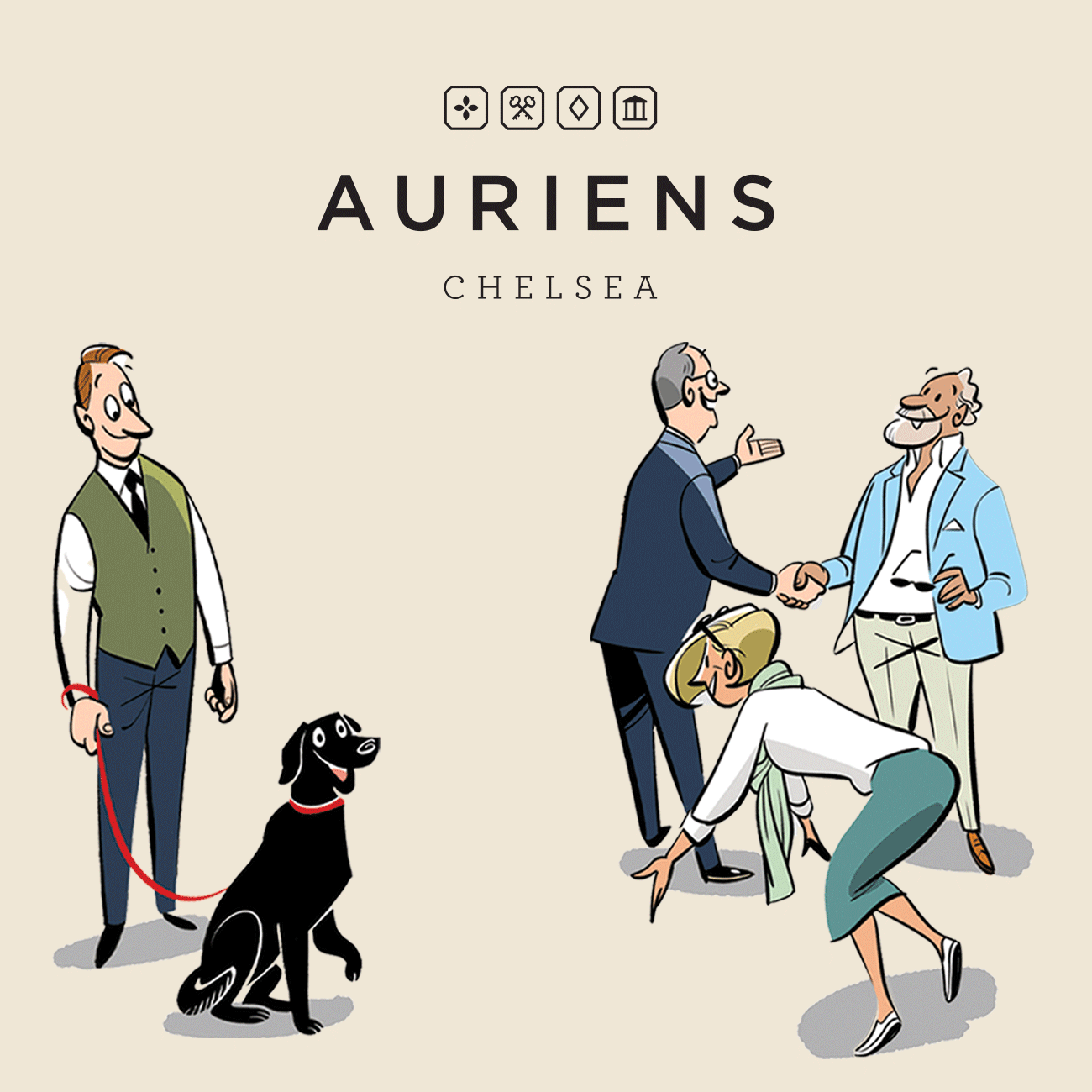
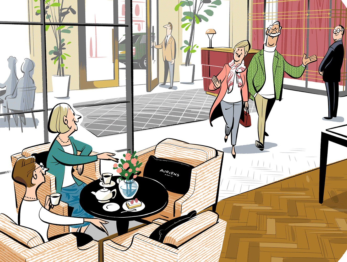
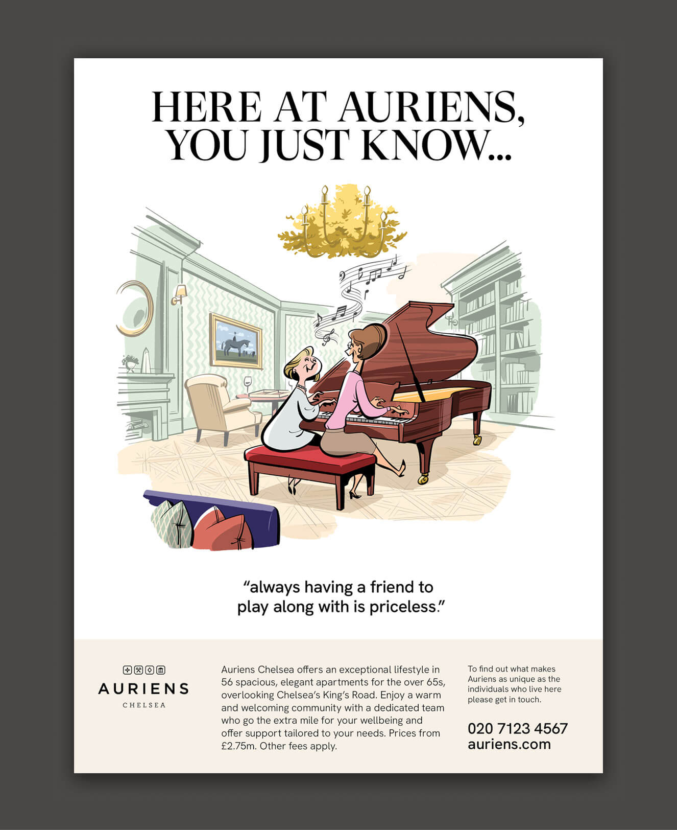
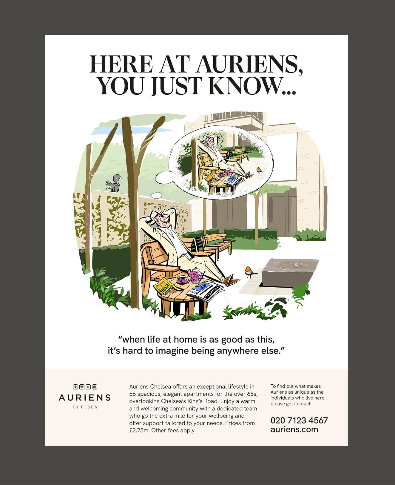
Japanese illustrator Satoshi Hashimoto has built an international following through style that feels at once effortless and meticulously considered. His work which is reminiscent of 1950s and 60s editorial styles, occupies a rare space where illustration becomes a form of quiet storytelling. Pollitt & Partners recently worked with Satoshi, bringing together an advertising campaign as part of a wider piece of work for Auriens Chelsea, the pinnacle of later living.
Interview: with illustrator Satoshi Hashimoto
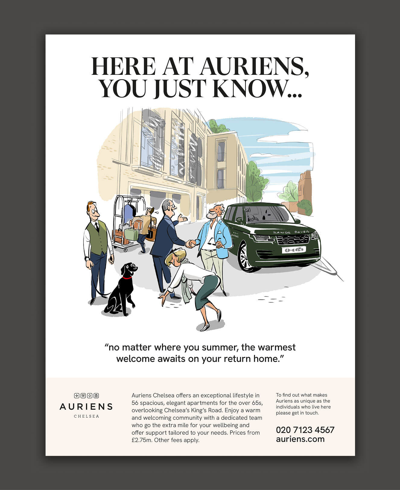
In an era saturated with visual noise, Satoshi Hashimoto’s work stands out for its calm confidence. It reminds us that illustration, when distilled to its essential elements, can be as evocative as any photograph or paragraph of prose: a world built from the simplicity of line, colour and and gentle human moments interpreted though one person’s way of seeing the world.
We worked with Satoshi through illustration agency Dutch Uncle to create a campaign that allowed us to forego the usual lifestyle-orientated photography of the later living sector, and embrace a soft humour, pathos and recognition.
P&P: How did you find your way to being an illustrator – what’s the journey so far that brought you to this point?
SH: I have loved drawing since I was a child, and I naturally assumed I would end up in some kind of job involving drawing. After graduating from a design school in my early twenties, I created works and took them to publishers, design studios and advertising companies, gradually getting more work. In my mid-twenties, I opened my own studio.
P&P: Your work can have a charming retro / classic quality – what’s influenced your style – maybe illustrators, or ad campaigns or an era of classic advertising?
SH: There is a unique area in Tokyo called Jimbocho, where many second-hand bookstores are located. I liked it and often went there. When I was young, I didn’t have much money and couldn’t buy many books, but I saw a lot of books in there and was influenced by them.
What made the biggest impression on me at the time were illustrated dictionaries for children from America in the 1950s and 1960s. Seeing them, I was reminded of the very basic principle that illustrations must convey what needs to be communicated in an easy-to-understand, fun, and beautiful way. And I was also influenced by American and European magazines, advertisements, and animation from the 1950s and 1960s.
P&P: What medium do you work in. How do you go from initial sketch to final illustration
SH: For a long time I painted with acrylic paints on paper, but for the past 10 years or so I’ve been using iPad and Mac. I still sketch with pencil on paper, then take a photo of it on my iPad and trace it to finish, sometimes using multiple drawing apps. Then, if necessary, I’ll do the final touches like adjusting colors on my Mac.

P&P: You use both full colour and restricted colour palettes in your illustrations. And do you create characters from real people?
SH: I prefer restricted colour palettes, if anything. I like simple expressions. And when it comes to the characters. There are cases for both real people, and just making them up!
P&P: Thank you Satoshi