VIEW
PROJECT

Soho

Rebellious, raw and unapologetic, Soho has always a place that defies convention. Our brand for London’s most identifiable district celebrates the unique streetscape, people and stories waiting be discovered when wandering through Soho’s maze-like streets and alleyways.

We partnered on

  • Animation
  • Brand
  • Brand guidelines
  • Brand idea
  • Brand strategy
  • Campaign creation
  • Content
  • Copywriting
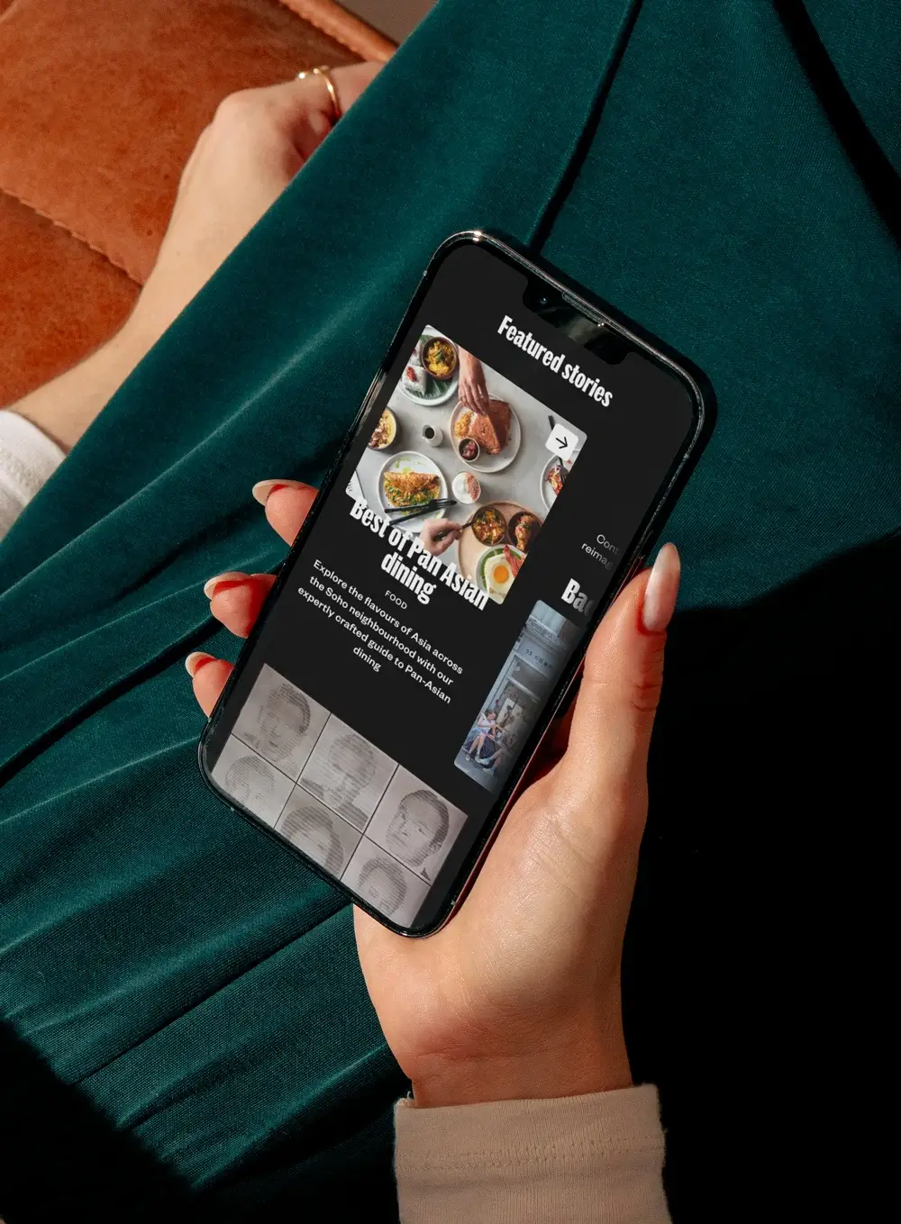
  • Digital design
  • Film
  • Photography
  • Visual identity
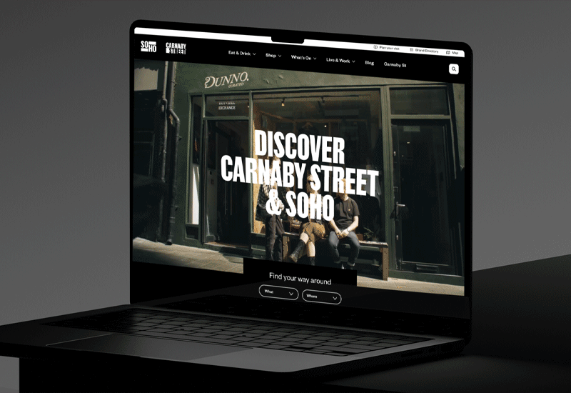
  • Website

The bold ambition

Soho! Where radical free-spirits rub shoulders with industry defining creatives, world-leading fashion and retail sits alongside small independents, and mouthwatering street markets mix with Michelin star chefs. We needed to create a brand and visual identity that could reflect this eclectic, electric, thrilling and beautifully imperfect wonderland.


The big ideas

Soho’s raw uniqueness is what makes it special.

Through strategy research and workshops, we landed on a concept of the tight streetscape of Soho being like a labyrinth – a place to wander and discover, where hidden, unexpected experiences sit alongside world-leading retail and lifestyle brands. A place where curiosity is rewarded; somewhere you never quite know where you may end up.

This gave us our starting point of “Lose yourself in Soho”.

We explored how the intersecting roads and alleys created a grid like playground – a canvas on which all the fun happens. The footprint of the streets runs through the visual brand style and the copy lines, with phrases like “Every Street a story” underlining the brand narrative.

The sensory overload experienced walking round was captured through animations, while working with focus groups highlighted how this idea resonated and delivered a relatable brand for an authentic destination.

Lose yourself in Soho

Soho invites exploration. Its myriad alleys, square and streets, flanked by tightly packed houses, shops, bars  and cafés make for a experience of discovery and surprise. We crafted a brand idea of “Lose yourself in Soho” – an open invitation to wander, but also to lose inhibitions.

A flexible design system

The tight streetscape of Soho inspired a design system and free form typography that’s endlessly flexible, capturing the vibrant nature of the neighbourhood.

“The unique labyrinth of streets that form the Soho landscape was a key motif and starting point for the creative route. Every street has its own buzz, rhythm, personality and history – each a canvas on which anything can happen.”

Matt Shelley
Creative Director

Colour palettes and animations

Much of Soho’s story is written after dark. A simple primary black and white colour palette was chosen with colour coming from content.

Animations reference Soho’s prevalent neon signage, constantly back and forth flow of people, and the raw and imperfect textures and nature of the place.

“‘Lose yourself in Soho’ is an invitation to wander, explore and discover those hidden gems, as well as ditching your inhibitions in this accepting and adventurous place.”

Lisa Richards
Strategy Director