The ambition
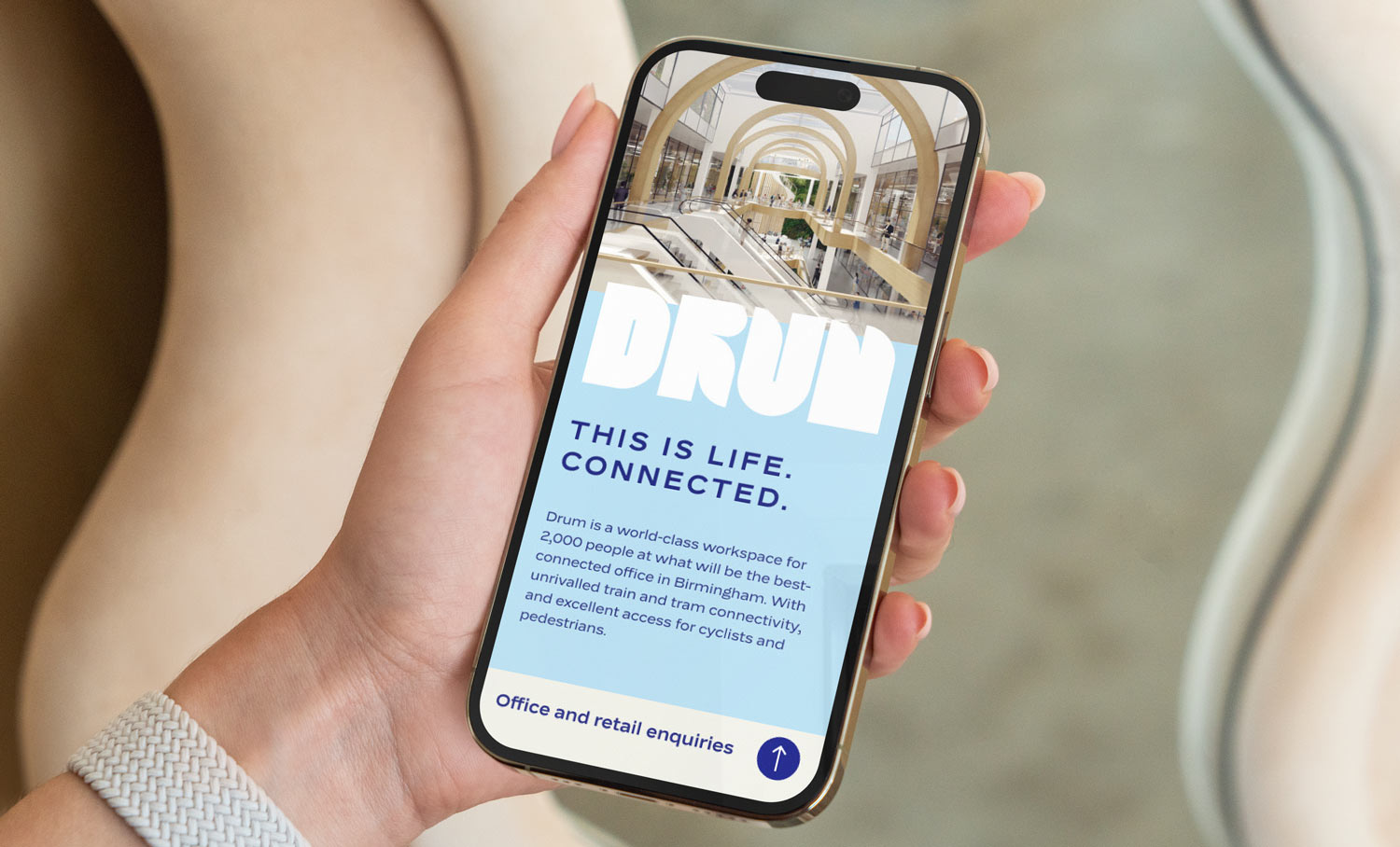
Drum will accommodate up to 2,000 people and will be one of the best-connected offices in the UK. Setting a new benchmark for sustainable development with a retrofit saving around 14,000 tonnes of C02 and with unrivalled train and tram connectivity, and excellent access for cyclists and pedestrians, this is a world-class workplace in every way.
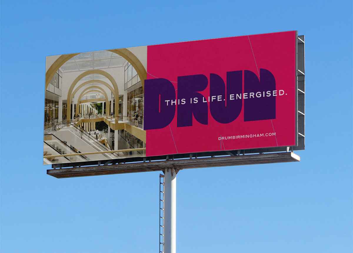
A bold and memorable name and brand was needed to mark a new start at Grand Central, the existing scheme. The brand needed to capture the imagination of people and workers locally and nationally and be truly representative of both the development and Birmingham’s vibrant spirit and personality.
The ideas
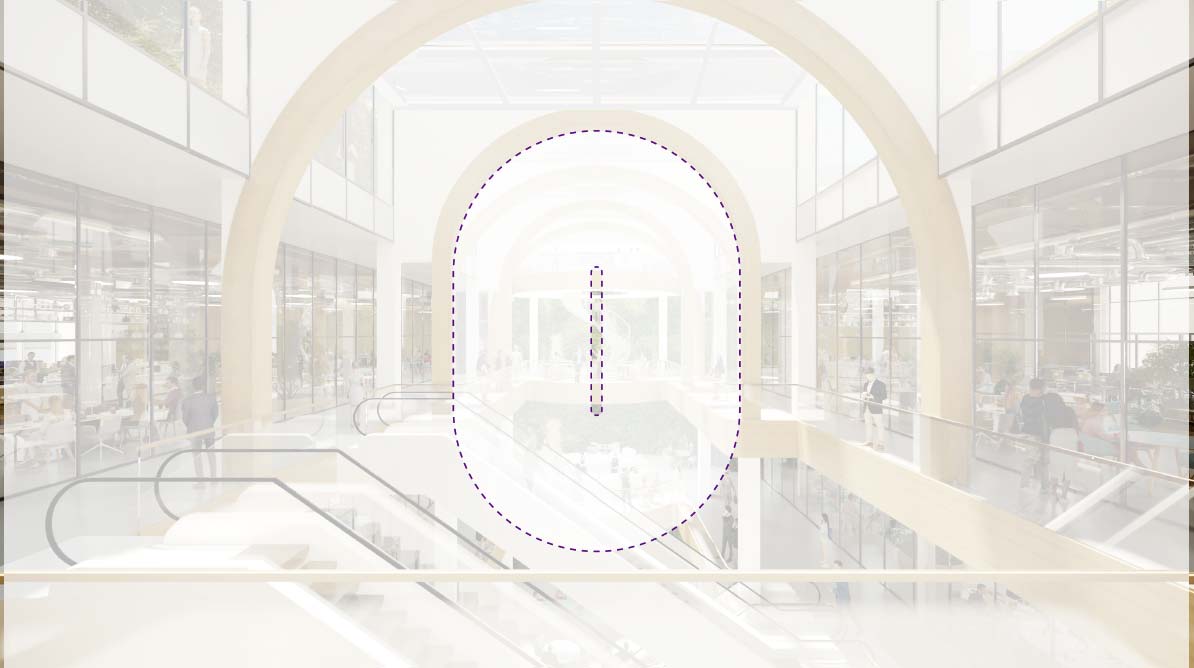
We conducted a series of interviews as part of the research stage with influential and leading thinkers from Birmingham who gave a unique insight into the personality of the city and its people. The name Drum was inspired by the distinctive shape of the existing building: a short, strong, evocative name that tonally felt ‘right’ for Birmingham, and one that would reinvigorate interest in the scheme.
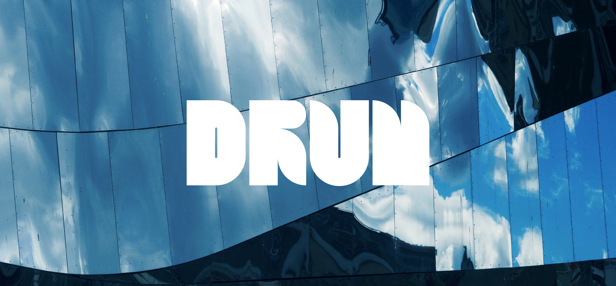
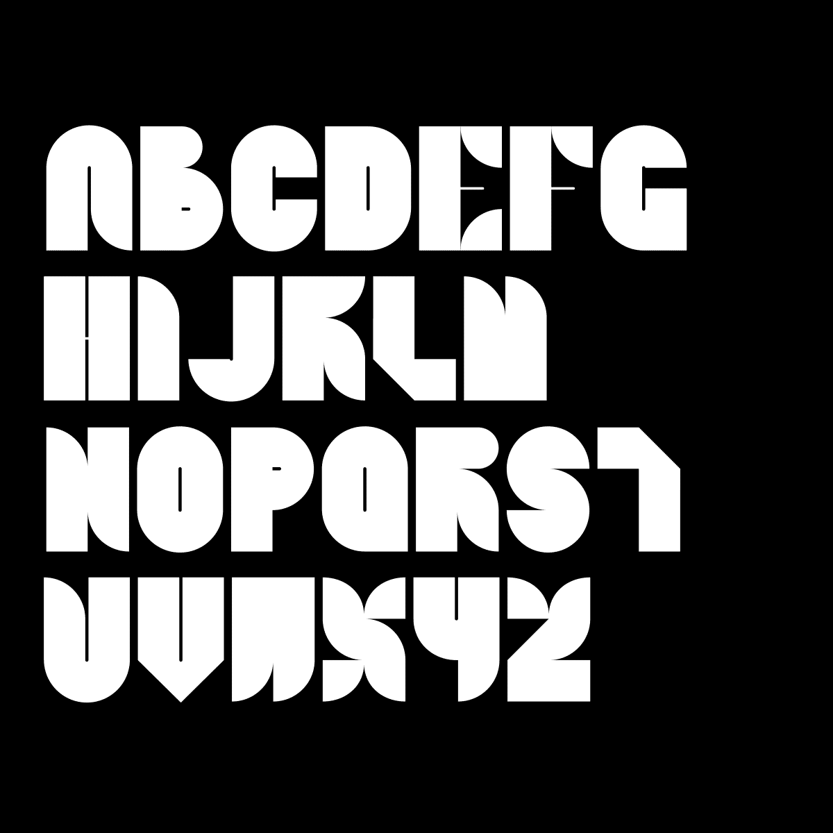
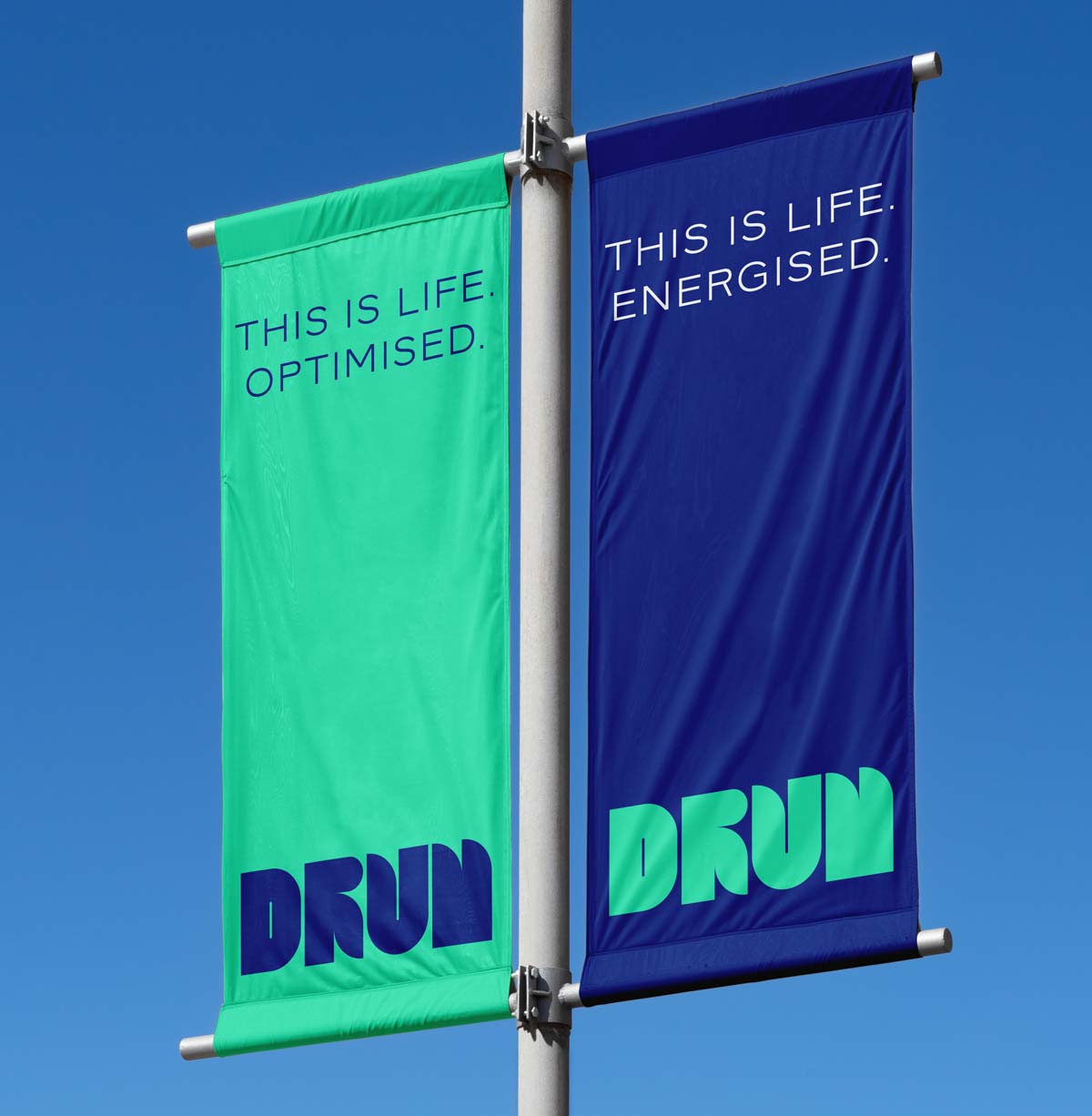
The wordmark was influenced by architectural detailing, with bright vibrant colours to capture attention on small digital screens and large formats, and a bespoke typeface designed with geometry matching MAKE architect’s interior vision.